
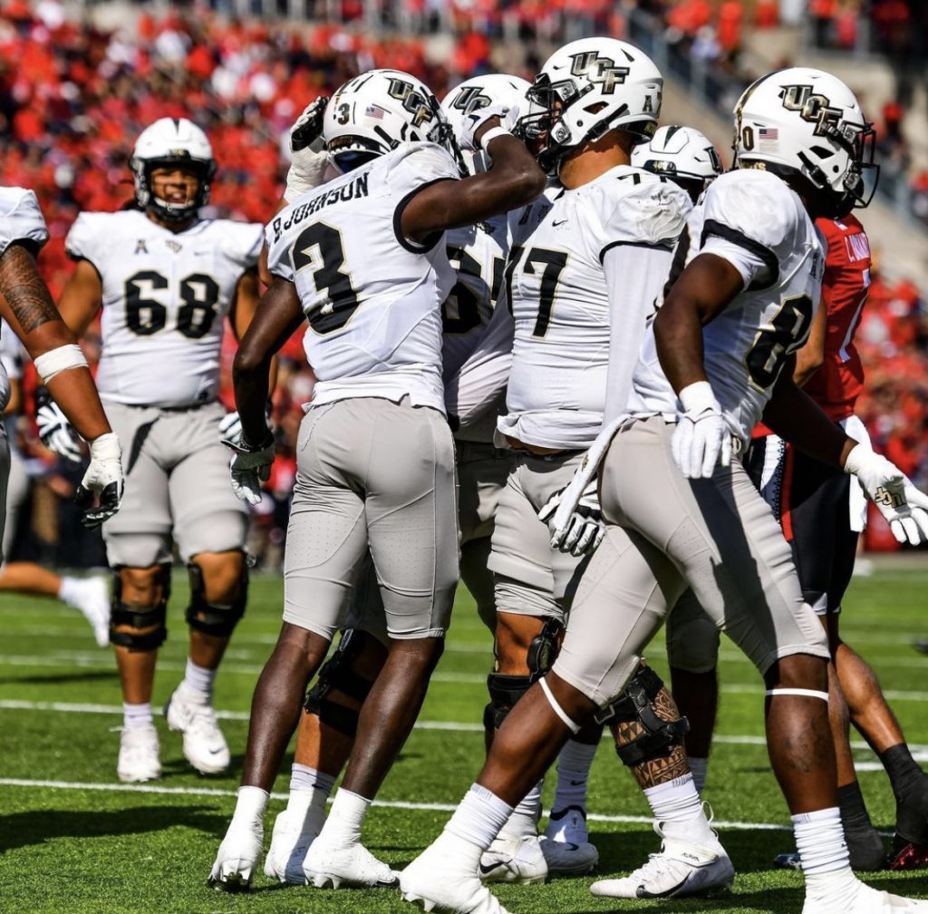
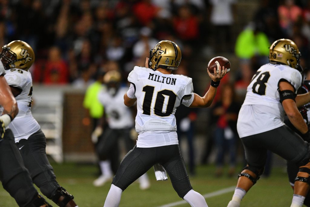
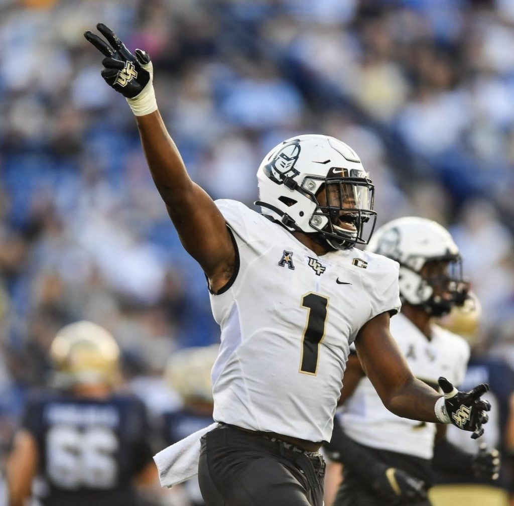
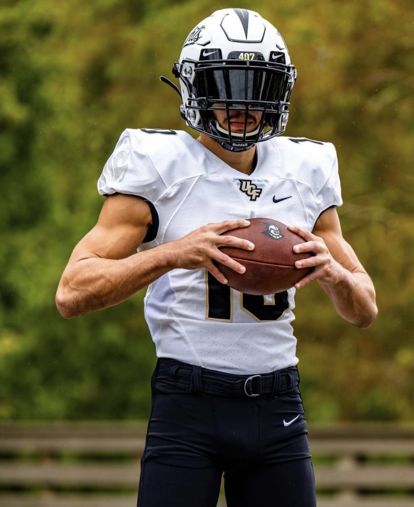
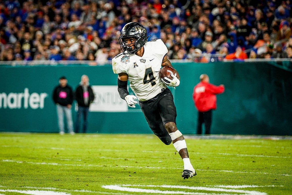
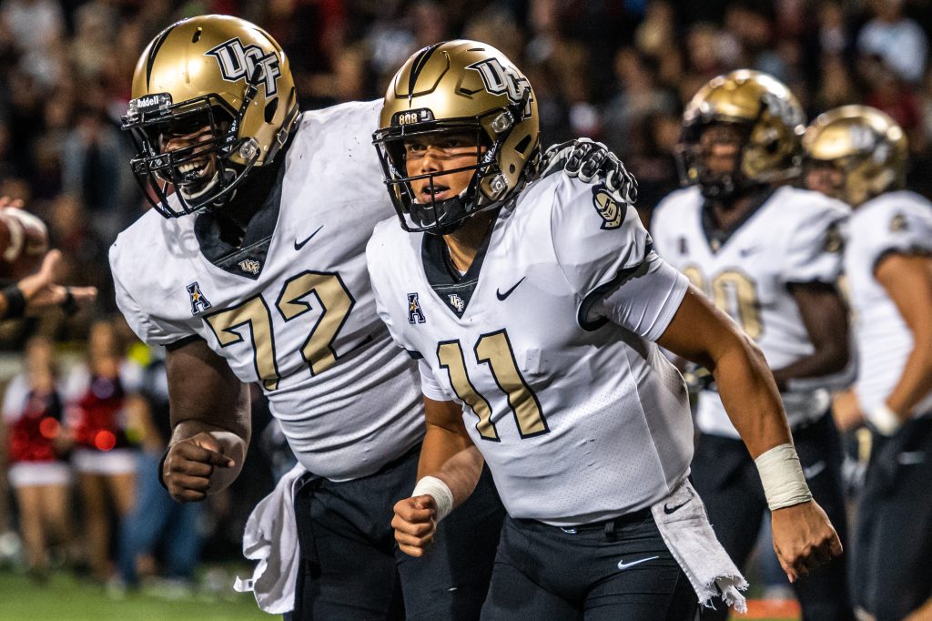
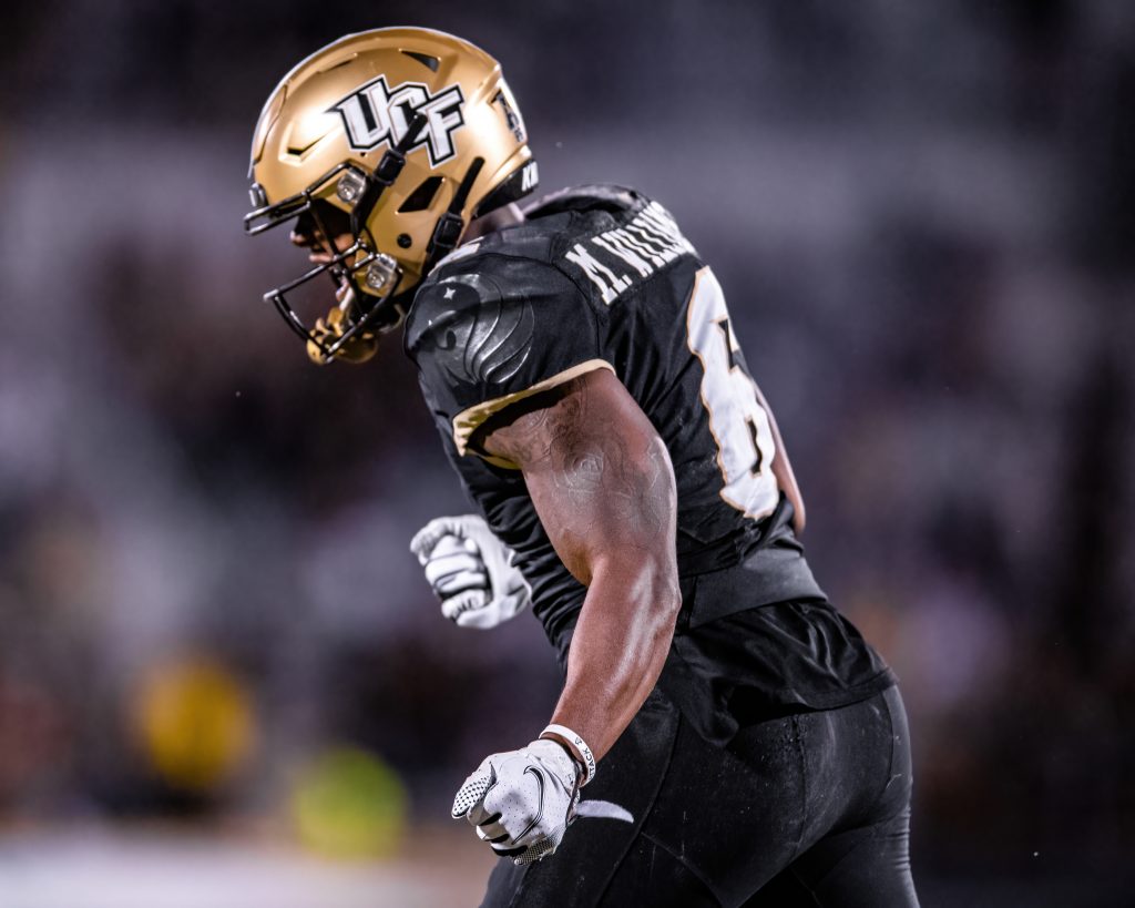
One of the most critical moments in UCF Athletics History is upon us: The Knights are getting new uniforms.
Athletic Director Terry Mohajir broke the news to the Orlando Sentinel a month ago and it’s the only thing I’ve been able to think about since. The only thing we know for sure, as Mohajir made abundantly clear, is that anthracite is gone for good.
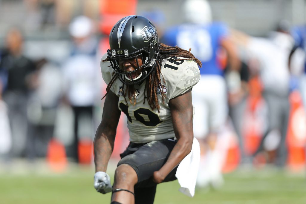
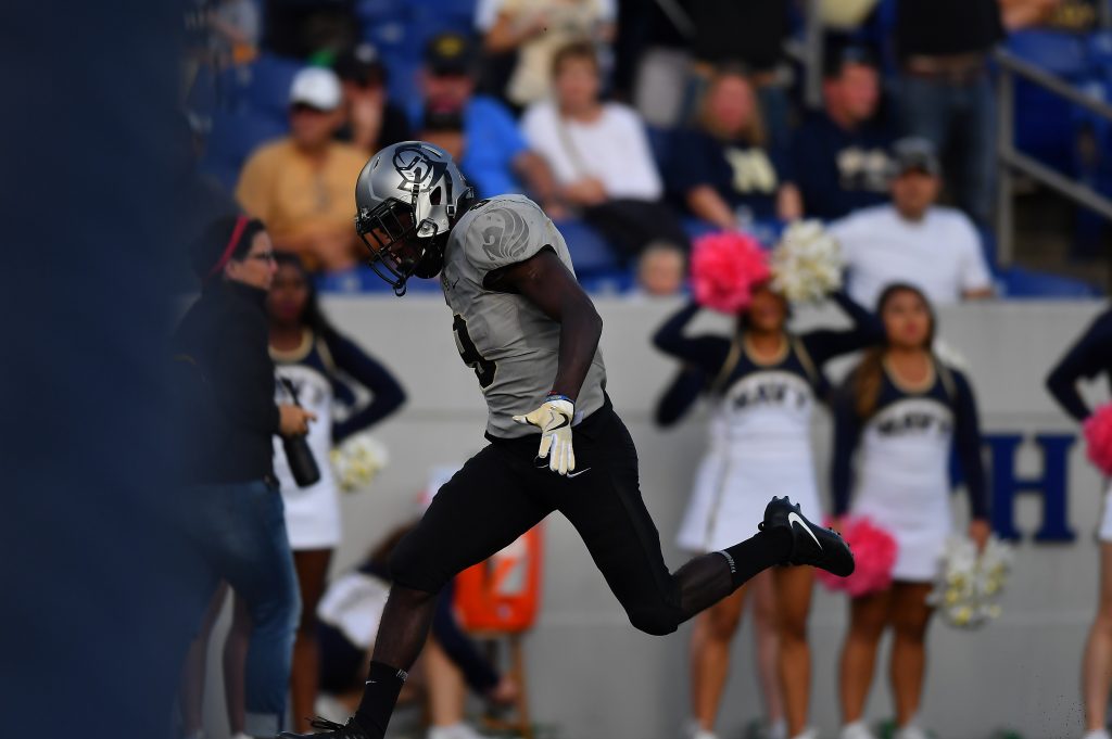
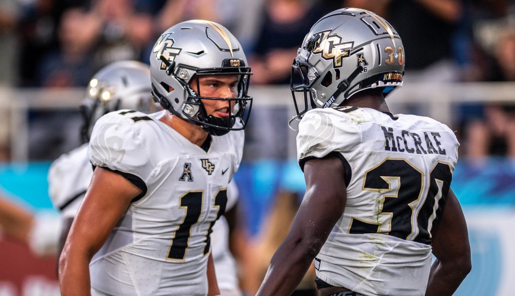
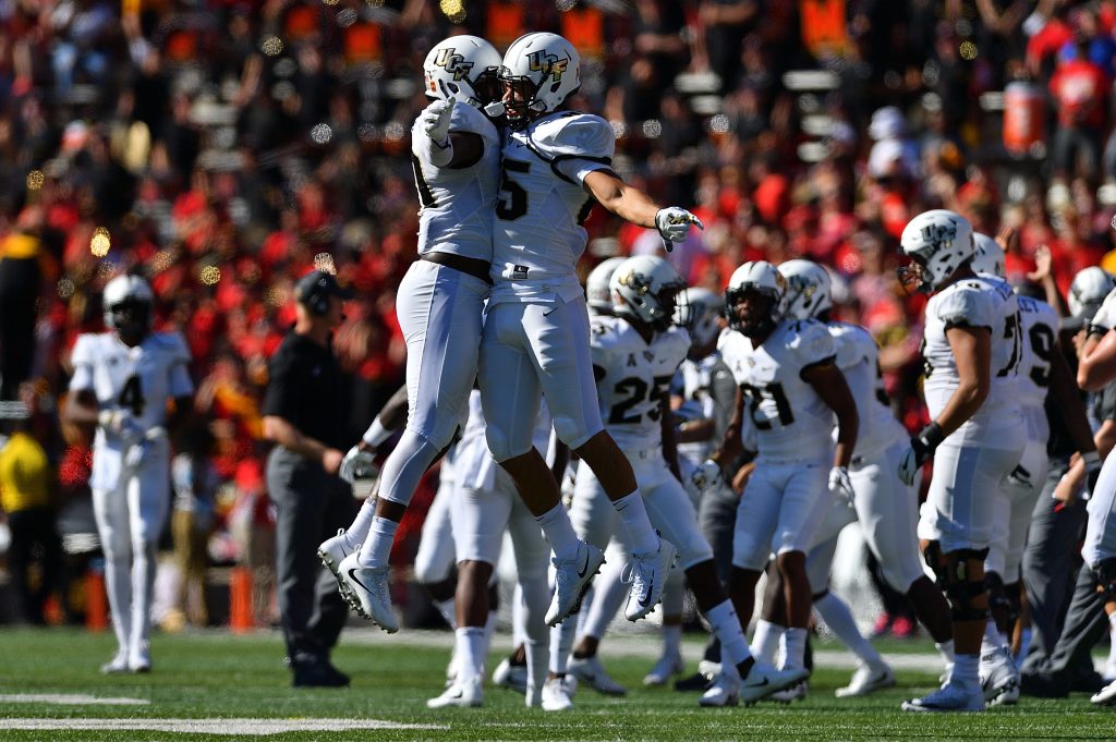
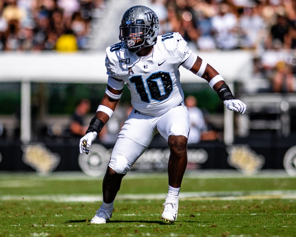
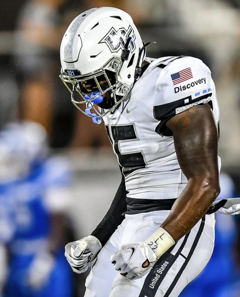
So, it’s time to look back on the apparently departing 2016-21 era UCF uniforms. These threads were a brand evolution for the Knights the likes of which we may never see again. UCF went from a team with literally one helmet and a couple run-of-the-mill jerseys to one of the most innovative and creatively dressed programs in the country.
All together, UCF wore 62 unique looks over the last six years. And, as a celebration of the end of this era, I ranked them all.
Check out the list here and let me know if you disagree!
(Disclaimer: I do not care if you disagree and if you do, you are wrong)
62. Gold/Anthracite/Black with patriotic decals
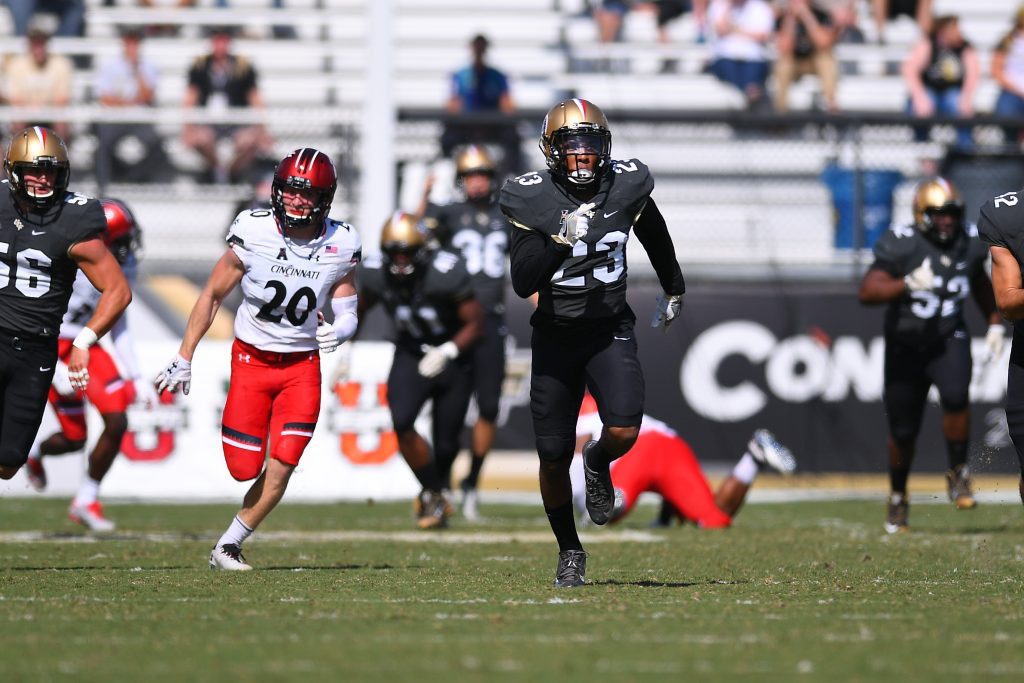
Game Worn: Cincinnati, 2016
Of the 62 looks UCF wore in these uniforms, very few have actually been objectively “bad”. But this. This is bad. The team gets a little bit of slack for trying this since it was only a few games into the redesign — which means there was still some experimentation going on with what looks good. But mixing a dark gray and a black with a brightly colored helmet featuring even more brightly colored decals was not the best idea. Other than the 2018 Navy game, this was the only time UCF ever mixed black and anthracite, so the lesson was clearly learned.
61. Pewter/White/Black with home state decals
Game Worn: USF, 2018
This was the first and only time that we got to see the pewter helmets in 2018. Unfortunately, our one glimpse at UCF in silver that year was ruined by a weird tri-color combo and a decal concept that could’ve been executed much better. Each helmet featured an outline of the player’s home state around the main logo. Which would be fine except that logo for some reason was incredibly tiny. Add in a chrome gold stripe and a combo featuring three colors and it’s easy to see why this look finished so low. (Did I subconsciously move this to the bottom of the list because it was also what the Knights were wearing when McKenzie Milton got hurt? Yep.)
60. Black/Black Knighthead/Gold with digicamo decals
Game Worn: SMU, 2018
Full disclosure: I had this combo at 40th when I last ranked UCF’s uniforms a couple years ago. I have no idea what I was thinking there. Blinded by my love of gold pants? Who knows. The bottom line here is that it’s always been hard to get the black knighthead jerseys to work and this combo certainly did not get the job done. The gold pants did match the jersey numbers but it came across as a weirdly top-heavy look with a black helmet. And the decals were just bad. You will learn through this list that I’m rarely a fan of the patriotic decal looks for any team, but the weird tan and brown within this logo just felt distinctly un-UCF.
59. White/Anthracite/Anthracite with patriotic decals
Game Worn: UConn, 2021
Alright, we are officially through all of UCF’s bad combos. That’s right. 62 looks in six years and 59 of them were varying levels of good. There’s a reason the Knights are DripU after all. Again, I’m just rarely a big fan of the patriotic looks. This was a pleasing enough combo, and the grays of anthracite or pewter always bring out a bit of a military vibe when paired with red, white and blue decals. But there are simply a lot of UCF looks from the last few years better than this one.
58. White/White/Pewter with chrome gold decals
Game Worn: Cincinnati, 2021
Once again, let’s be clear that I am ranking these combos exclusively on the combos themselves. Nothing that happened in the game plays a role. I swear this isn’t here because UCF wore it as the Cincinnati Bearcats tore the Knights to shreds. It’s here because the Bearcats tore the Knights to shreds in a day game and the pewter pants were barely indistinguishable from the white jerseys and helmets. I love pewter with all my heart but pairing it with all that white in the sun gave it a distinctly washed out feel. If supply chain issues hadn’t been a problem in 2021 and UCF could’ve donned pewter helmets for this game, it would’ve been a hell of a look (as you will see much higher on this list.) The AAC not getting approximately a billion day games each year also could have helped.
57. Gold/Black Knighthead/Black with white UCF decals
Game Worn: BYU, 2020
I was expecting to like this a lot more than I did when the combo was first revealed. The gold helmet would pair with the gold numbers. The white UCF decal would match the collar and sleeve trim. This should be a perfect look. But what drags it down more than anything is that is simply can’t hold a candle to this exact combo with the Pegasus jerseys that we saw in 2018 and 2020. Watching the game, I just couldn’t help thinking to myself “man, this would look so much better with the other black jersey.” (Yes, that’s what was on my mind as BYU dominated UCF.) So chock this ranking up to the black knightheads striking again.
56. Black/White/Black with normal decals
Game Worn: Michigan, 2016
Here’s another combo getting dragged down pretty much exclusively because we got a better version of it later. Black/White/Black is always a solid and tough road look but, man, those traditional decals UCF sported for much of 2016 were so bland. The chrome gold version of this look we’ve seen a handful of times since is elite. And much higher on this list.
55. Gold/Anthracite/White with white UCF decals
Game Worn: Stanford, 2019
Let me be clear: I hate this combo. Hate it. It’s a mismatched tricolor mess and opting for anthracite over black was just the cherry on top of confusion for this look. But I placed this combo third to last in my rankings from a few years ago and a bunch of you went ballistic. I even see fans quote this as one of their favorite looks from time to time. And you’re insane. This is not good. But, just for the fans and since I’m clearly in the minority, I’ve boosted this combo a handful of spots. Congrats.
54. Gold/White/Anthracite with normal decals
Games Worn: Cincinnati 2017 and East Carolina 2018
Plenty of fans disagree with me on this, but I just don’t love tri-color combos the way you all do. It feels like there’s too many things going on at the same time, and throwing gold, white and dark gray into the same combo is over-complicating things. A truly good uniform flows. This doesn’t. I was worried it was becoming an annual look after making appearances in 2017 and 2018, but we luckily haven’t seen it since.
53. Gold/Black/White with normal decals
Game Worn: Memphis, 2020
This combo could’ve been a lot higher with a decal tweak. As I just stated above, I don’t love tricolor combos but this was a really decent on-brand uniform, sort of the home version of the gold/white/black combo that’s a fan favorite (even though this was oddly enough worn on the road). But, man, the white UCF decal would’ve been perfect here. You would’ve had white flow through the whole uniform from pants to jersey numbers to decal. Oh well. Still a solid combo.
52. White/White/Anthracite with normal decals
Game Worn: East Carolina, 2016
This is another example of a group of combos that was vastly improved when the team switched to chrome gold decals in 2017 over the normal jumbo-sized UCF logo we saw for most of 2016. This is a serviceable away look, and it was nice at the time. But it’s been buried by so many other cool designs and combos over the last years.
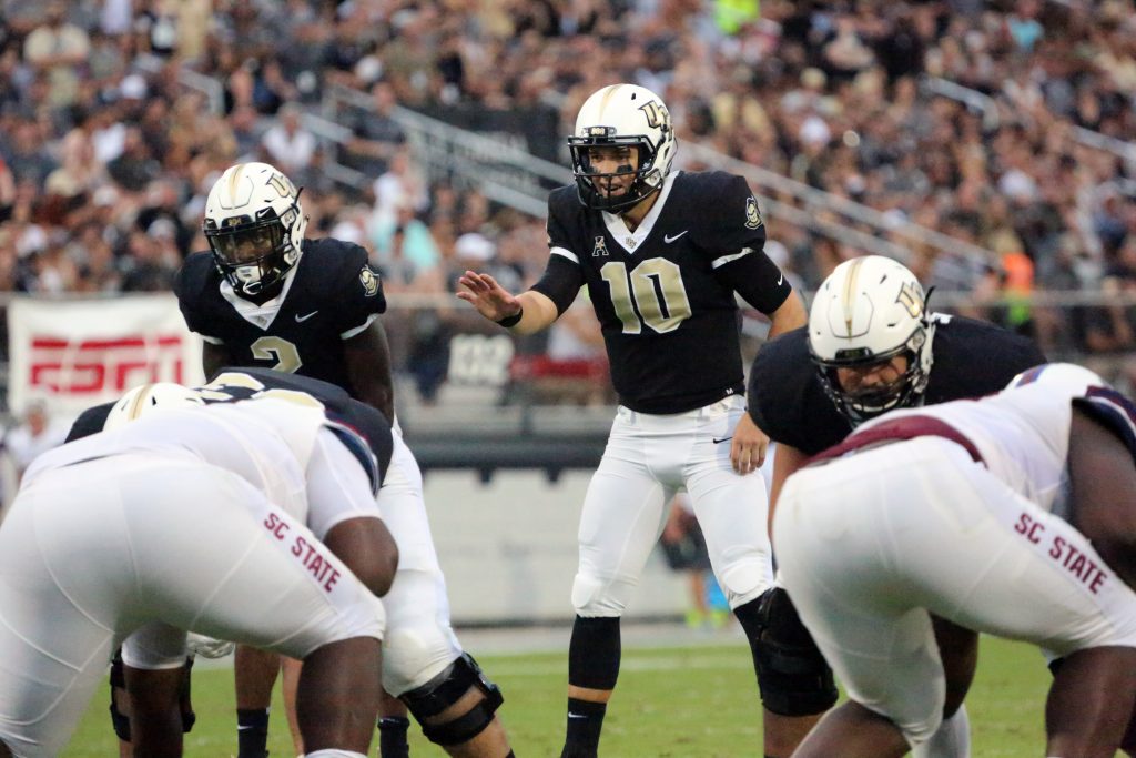
51. White/White/White with normal decals
Game Worn: SC State, 2016
And here is the first ever combo we saw of the 2016-2021 uniform set, as the Knights rang in the Scott Frost era with a whiteout on a special field design with white logos. It’s hard to screw up a whiteout and, while I ranked this the lowest of UCF’s different all-white looks, it was still a breath of fresh air to see after years of pale yellow jerseys and basic helmets.
50. White/White/Black with black knighthead decal
Game Worn: Navy, 2021
Okay, so this combo was unfairly dinged because the new-and-improved knighthead was unveiled (and worn as a decal) weeks later. But that doesn’t change that this was a sharp, tough road look. I love combos that go all in on black-and-white color schemes and this does so admirably. The one change I would’ve made here would be to balance the decals by placing the knighthead on both sides of the helmet. Another change I would’ve made that day is not put Joey Gatewood in just as Mikey Keene gets in a rhythm. But that’s another article for another day.
49. Pewter/Pewter/Pewter with normal decals
Game Worn: Houston, 2016
Here’s another combo I’m moving up pretty heftily since you all deeply disagreed with my thoughts on it last time I ranked uniforms. I love pewter. If you’ve spent more than 30 seconds on my Twitter profile you know this. But nothing but pewter is a bit much and a fairly bland. UCF did some much more creative things with that fantastic color over the following years.
48. White/White/Anthracite with chrome gold decals
Game Worn: Temple, 2017
The chrome gold decals make such a huge difference for this combo. UCF switching that to become its primary decals in 2017 was one of the best decisions this program has ever made, up there with claiming a national championship or recruiting McKenzie Milton. Even a combo like this, which was just OK with normal decals, pops so much more with that glint of gold on the helmets.
47. White/White Knighthead/Black with chrome script decals
Game Worn: Temple, 2021
I really loved this combo. The script decals we saw handful of times through 2021 are superb and the chrome gold of the decal for this game was nicely balanced with the gold numbers of the white knighthead jerseys. The only issue is that a lot of you hated this jersey. You’re all wrong, of course, but that still surely lowered this combo in many of your eyes. Again, you’re wrong. I mean it’s not like this is the black knighthead jersey or something. If anyone tweets at me complaining this is too high just know I’m blocking you immediately.

46. White/Black/Black with patriotic decals
Game Worn: UConn, 2019
As I’ve said higher up, I’m just not a fan of the patriotic combos. But this was a look I could somewhat get on board with. Going all black for the jersey and pants kept it looking like a Knights uniform and the patriotic UCF logo has never looked better than with a white background. Not to mention a patriotic knighthead decal on the other side of the helmet that was cool to see if a little confusing with a star pattern piercing the eyes.
45. White/White/Black with flake script
Game Worn: SMU, 2021
Leave it to UCF Equipment to always keep the fanbase on its toes. We’d barely wrapped our heads around the fact that the chrome gold script Knights decal was now in rotation before they hit us with this truly fantastic black version with gold flakes shining throughout the logo. White/white/black is a deeply underrated road combo and pairing it with these unique yet subtle decals made for a heck of a look.
44. Pewter/Pewter/Pewter with patriotic decals
Game Worn: UConn, 2017
And here’s the one situation where an all-pewter combo actually worked perfectly. Combining a light gray almost reminiscent of the color of battleships with the red, white and blue decals gives off this military vibe that was fitting and made for a solid look. The only thing that knocks it all the way down here is that, no matter what, it’s still a patriotic combo and red, white and blue still just looks weird on a UCF uniform.
43. Gold/Pewter/Pewter with rivalry decals
Game Worn: USF, 2016
For the record, I like the combo by itself and am mildly upset we never saw gold and pewter mixed again. It’s literally a silver-and-gold uniform; who wouldn’t like that? And this combo even has a variation of the “State of Florida” UCF decals, which I’ve always loved seeing. But the rivalry-specific decals weigh it down. The sword stripe features the War-On-I4 catchphrase as well as a map from Orlando to Tampa. Cool concept, right? The only problem is that it was way, way too small to be noticeable unless you were holding the helmet up to your face. This was also back when USF was briefly the dominant team of this rivalry, and it rubbed me the wrong way that the Knights were literally changing their uniforms to represent the rivalry and the Bulls had not responded in kind. It made UCF seem like the one vying for attention, which is never a glamorous spot to be in.
42. White/Anthracite/White with chrome gold decals
Games Worn: Austin Peay 2017, Pitt 2018 and LSU 2019
For whatever reason, anthracite worked best when paired with white. It offers a bit less contrast than black-on-white, which might sound like a bad thing but it’s a nice breath of fresh air every now and then through the course of a season (willing to bet Terry Mohajir would have this combo last on his list). There are just a lot of better looks that have buried this one down into the 40s, but it was always a serviceable combo for UCF to go to.
41. Black/Black/Black with gold knighthead decals
Game Worn: Tulane, 2016
This was the first blackout that we got to see after the team redesigned, and it was unsurprisingly a good one. It also came back in the day when UCF dropping surprise decals before a game was unusual and a big deal, making the gold knighthead even more cool. Seriously, guys. If you weren’t around yet as a fan, just know that helmet was earth-shattering news. (In 2016 alone, UCF wore nine helmet designs after wearing just three from 2007 to 2015. I mean, come on.)
40. White/Black/Gold with chrome gold decals
Game Worn: East Carolina, 2021
Some of you had complaints about the gold pants, but I absolutely adored this combo. There was a time where white/black/gold was practically the only thing UCF wore. Finally getting to see a modern take on it in the final year of these uniforms was truly special. Given Mohajir’s well-documented emphasis on the Knights sticking with black and gold going forward, I wouldn’t be surprised to see a new take on this combo in the near future.
39. White/White/White with chrome decals
Game Worn: Memphis, 2018
It’s amazing what a difference just decals can make for an overall look, with this combo coming in 12 spots higher than the same exact uniform but with normal decals. Chrome looks so nice. This was also a slightly altered take on one of my favorite UCF helmets ever, which featured the chrome UCF on one side and a chrome knighthead on the other. (The decals didn’t show up super well in the game because it was an overcast rainy day in Memphis, but we don’t knock combos for weather-related reasons here at Knight Sports Now.)
38. White/Anthracite/Anthracite with chrome gold script decals
Game Worn: Bethune-Cookman, 2021
That script decal is glorious. Absolutely glorious. I am ready for about 90 more versions of this in 2022. Just think: a blackout with a white script Knights decal. Or chrome! Or chrome gold! The possibilities are endless! Seriously though, this was a heck of a look. It was the first and best look including the script that we saw in 2021 and it’s frankly hard to beat. Wouldn’t surprise me if we saw this exact look but with black jerseys and pants down the road.
37. Black/White Knighthead/White with chrome gold decals
Game Worn: Tulsa, 2019
This is one of my favorite UCF road looks ever. Again, the white knighthead jerseys can be great when used properly. I lowered this a ton from my previous rankings mainly so you all don’t yell at me again. But there’s an argument to be made that this belongs much higher. The mark of a good combo is when UCF can be in the middle of losing a game against a team that they absolutely should not be losing to under any circumstances, and I can still think, “Well, they look nice at least.” This combo, unfortunately, passes that test.
36. Gold/White/Gold with normal decals
Game Worn: Houston, 2020
There was some fan trepidation when this combo was unveiled (as there has been virtually every time the gold pants are involved) but it turned out to be a really nice on-brand road look. There is a little bit of trickiness depending on the lighting since the gold of the helmet and pants don’t perfectly match (for those of you who keep saying they need to pick the same gold, they do. It’s a texture issue, not a color issue. Every color looks different on a helmet than fabric, it’s just particularly noticeable with gold) but it’s not super noteworthy and doesn’t take away from what’s an overall solid combo.
35. White/White/Black with chrome gold decals
Game Worn: Pitt, 2019
I’m honestly surprised that it took more than three years into the redesign for UCF to try out this combo. We’ve seen several variations of it in the years since, but this straightforward version featuring the usual chrome gold decals was just so simple and sharp.
34. Gold/White/Black with normal decals
Games Worn: UConn 2016, SMU 2017 and East Carolina 2020
Fans love this combo and it has oddly enough become sort of the default road look people think of when picturing UCF. And It’s obviously nice since I ranked it this high. But, as usual, I’m just not a big fan of tricolor looks. At least this one offers more contrast and just feels more “UCF” than the anthracite pants version.
33. White/Black/Black with chrome gold decals
Game Worn: Memphis, 2018
A really simple, straightforward look, to the point that I’m surprised it took us almost three years to see it. I’m never going to say no to matching the black pants and jerseys together and the white helmet pops nicely to finish it off. This is obviously a variation of the patriotic look that came in at No. 46, but the chrome gold decals bump this one up quite a bit.
32. Black/Black/Black with black knighthead decals and military bumpers
Game Worn: Temple, 2020
This. This is what a military appreciation uniform should look like. Play into the theme, show off some patriotism, but all within the realm of your established brand. This combo was a blackout to the max, pairing the black lids with black knighthead decals for a “Black Ops” look. Throw in military branch bumpers and you have far and away the best patriotic look of the 2016-21 uniforms.
31. Black/Anthracite/Anthracite with state of UCF decals
Game Worn: Navy, 2018
I’ve always loved the “State of Florida” decals that UCF originally sported back in the 1980s and 90s. We saw a modernized version in 2016 but finally seeing the original design return to the field in 2018 was really, really awesome. This combo could’ve been a lot higher if it was a blackout instead of all-anthracite (an anthraciteout?) but it is what it is. Wow, maybe Mohajir and I agree on uniforms more than I thought.
30. White/Anthracite/Anthracite with chrome gold decals
Games Worn: FIU 2017 and FAMU 2019
I almost always prefer black over anthracite, but this combo just looks better with dark gray than black and I can’t explain why. It just does. This look is also colloquially known as “the thing that UCF wears when opening the season against an inferior instate opponent.”
29. White/Black/White with chrome knighthead decals
Game Worn: Tulsa, 2016
It’s a genuine crime that we never saw this helmet again after 2016. It’s the first ever surprise decal that we got from UCF (revealed during homecoming week and worn again with this combo in the home finale) and it’s up there with any other helmet the team has worn, even the space ones. The combo itself is very nice as well. It’s hard to make black, white and chrome look bad together after all.
28. Pewter/Black/Pewter with normal decals
Game Worn: FIU, 2016
Mixing black and pewter together has made for some of UCF’s finest combos over the last few years. Those colors work so well together, and I’ve always been impressed with how seamlessly light gray fit into UCF’s color scheme. As is the case with a lot of 2016 combos, this one gets dragged down by the decals, which are fine but unspectacular compared with the ones we saw in later years.
27. White/Anthracite/White with chrome knighthead decals
Game Worn: Temple, 2016
You can hop back up to No. 29 for my thoughts on these awesome helmets. Switching the black jerseys for anthracite makes a big difference here though in another rare instance where dark gray just looks better. If feels like the white and chrome flows into the gray more naturally than it does into black, making this a more complete look than the black jersey version.
26. White/White/White with State of UCF decals
Game Worn: Tulane, 2021
Shoutout to 2018 me who was just itching for a full blackout with the State of UCF lids. A whiteout never even occurred to me and, holy hell, it is fantastic. This was a top tier homecoming look, and I liked the decision to place the sword stripe on the helmet as well to still keep this feeling like a modern look instead of a full-fledged throwback.
25. Black/Black Knighthead/Black with player decals
Game Worn: USF, 2017
Here we are. The Top 25. The elite of the elite. The 25 finest uniforms that UCF has ever sported. Let’s kick it off with a jersey that fans hate! Ok, I know the black knighthead jerseys are divisive, but what gets this combo here is the helmet, which is fashioned with some amazingly unique decals that each feature a photo of the player wearing the helmet shimmering within the UCF logo. I don’t know how you even conceptualize that, let alone pull it off.
24. Gold/Anthracite/Anthracite with normal decals
Games Worn: Maryland 2016 and Georgia Tech 2020
At the time this combo was first worn, it was the first game where UCF had worn gold helmets in 10 years. That was way too long of a stretch and it’s been great to see the gold lids worn regularly since then. Nostalgia points have played no role in this list, but can’t finish this paragraph without reminding you that this was also the first UCF uniform we ever saw McKenzie Milton take the field in. That has to count for something.
23. White/Black/White with chrome gold decals
Game Worn: Boise State, 2021
It’s pretty crazy that it took six years to finally see on the field what feels like one of the most boilerplate UCF looks. But it sure does work well. The white helmet and pants naturally match with the jumbo size white numbers of the black jersey, and the glint of gold up top from the decals was just perfect. An all-around excellent look.
22. Black/Black/White with space decals
Game Worn: East Carolina, 2017
And here is the first of the space looks that UCF has been sporting annually since 2017. There really are few uniform concepts in college football that can match the sheer creativity of capturing a school’s ties to the space program on its helmet. The moon decals, the constellation stripe and little white stars dotting the black helmet made for an amazing look. But the overall uniform is dragged down by a just OK combo. This should’ve been a blackout, and the white pants look out of place. And as amazing as the helmets are, they didn’t exactly match with the gold trim of the jerseys. Luckily, that wasn’t a problem for UCF going forward as the team moved beyond just decals when it came to the Space Game.
21. White/Black Knighthead/White with chrome gold decals
Game Worn: SC State, 2018
Listen up black knighthead haters: there are some, very certain, combos that can perfectly accentuate the jersey that you can’t stand. This is one of them. The white helmet and pants balance out and match the white collar, and the chrome gold decals pair nicely with the gold numbers. I’m convinced that if we saw those jerseys for the first time ever with this combo that they could’ve been a fan favorite alternate.
20. Black/Pewter/Black with chrome gold decals
Game Worn: Marshall, 2019
If you follow me on Twitter (or have read any of this article), you’ve probably seen me say this often: pewter is amazing. It’s such a perfectly complementary color to the Knights’ scheme and that was on full display in this game when the pewter jerseys were book-ended with black pants and lids. The special decals which featured the state flag shimmering within the UCF logo were an extra nice touch.
19. Black/White/Knighthead/Black with white decals
Game Worn: UConn, 2018
OK, for as inconsistent as the black knighthead jerseys are, the white version is excellent. The gold numbers and large collar fit a lot more with a white background. The black collar in particular matched incredibly well with the black helmets and pants in this combo. Add in a white UCF logo with hints of gold accents to match the jersey, and you’ve got an amazing look.
18. Black/Pewter Space/Pewter Space
Game Worn: Tulane, 2020
Now wait just one minute. We’ve got a combo that includes all of UCF’s space connections intricately yet seamlessly flowing throughout the uniform, from the helmet stripe made up of the blueprints for a NASA spacecraft to a circular navigation grid featuring elements of UCF’s campus on the pants. AND IT’S PEWTER?? You all are so lucky I didn’t just call it a day and place this at No. 1. It’s still my personal favorite as far as space uniforms. But I’m willing to admit there are still a handful of combos to go that are objectively better. But man. What a uniform.
17. Black/White/Black with chrome gold decals
Games Worn: Temple 2019, USF 2020 and UF 2021
This really may be the most quintessential UCF road combo. It’s just perfect. Combos that match dark helmets and pants with a light jersey always give off a tough, strengthened vibe and that makes it a great look for going up against opponents away from home. Now I’m not supposed to factor game conditions into these rankings, but this look was especially on point against Florida in the Gasparilla Bowl. The extra bright NFL-level lights of the stadium caused the chrome gold of the decals to practically light up on the field. It was the ideal look for such a meaningful game.
16. Black/Pewter/Black with chrome decals
Game Worn: Memphis, 2017
Essentially the same combo that we saw against Marshall in 2019, but this version gets a bump by matching the gray jerseys with silver decals. The helmets popped beautifully, especially in a sunny day game. I also have no idea why this is the case but the sword stripe is significantly wider on this helmet than any other UCF lid from the past six years. Dear UCF: please include wider sword stripes with the new uniforms. If there are still sword stripes. Wait are there still going to be sword stripes?
15. Pewter/Pewter/Black with black knighthead decals
Game Worn: Navy, 2017
Ah, back when UCF could wear a different decal on each side of its helmet and you all didn’t throw a Twitter tantrum. Seriously, why did that randomly become a problem fans had with combos in 2021? The Knights had done that for years (I agree in some cases but still). Anyways, this might be the most underrated road combo that UCF has worn since the redesign. Pewter and black mix so well together and this look really showcased it. Add in the black knighthead decal (on one side of the helmet), and we’ve got a fantastic combo on our hands. No one mentions this one when talking UCF uniforms, but it’s up there with the elite looks.
14. Pewter/White/Pewter with chrome gold decals
Game Worn: FAU, 2019
As much as I love pewter, I have been fine not seeing it mixed with white. The only glimpse we had gotten of this before 2019 was a spring game where UCF wore white/pewter/pewter and it was … bad. I didn’t think there was enough of a difference between white and light gray to make it work. That’s a big part of what dragged down the 2021 Cincinnati combo. But this look is just pure art. It was my personal favorite road look for the Knights in 2019. It just came off as so sleek, and the gold in the decals did enough to keep it feeling like a UCF uniform.
13. Gold/White Knighthead/Black with white decals
Game Worn: Cincinnati, 2019
I said earlier that I don’t care much for tri-color combos but this one gets a pass because it’s absolutely terrific. The gold and white helmet mirrors the white and gold jersey. The black pants match the black collar and sleeves. What a look. Unfortunately, UCF fans have to remember this combo with sadness since it was worn as the Knights fell to the Bearcats, effectively ending their conference championship and New Year’s Six hopes in 2019 while also acting as the spark that ignited Cincinnati’s eventual run to the top of the Group of Five. But a great uniform is a great uniform. I don’t make the rules! (Disclaimer: I do make the rules).
12. White/White/White with chrome gold decals
Games Worn: Maryland 2017 and Tulane 2019
This is one of those combos that is so simple and yet so perfect. All-white but with oversized black numbers with gold trim, bright flashes of gold on the helmet and the always-wonderful Pegasus shining on the sleeves. It’s a truly terrific combo and it says so much about how great UCF’s uniforms are that this isn’t the highest whiteout on the list.

11. Pewter/Black/Pewter with chrome gold decals
Games Worn: Memphis 2017 and East Carolina 2019
Just in case you missed it the first 80 times I said it, I really do love pewter. Some fans have complained this combo looks too much like the Oakland Raiders, but there’s enough gold (and UCF and Pegasus logos) to make this a clear UCF look. It’s an awesome combo and obviously got a huge jump over the normal decal version way back down this list. I can’t stress enough how positively the chrome gold affected the Knights’ uniforms when it was adopted in 2017.

10. Black/Black/Black with chrome gold decals
Games Worn: Arkansas State 2016, USF 2019 and Tulsa 2020
We’re finally here: The Top 10. Naturally, we must kick off the most elite tier of Knights uniforms with a blackout. For a lot of fans, this is still the default uniform that comes to mind when they think of UCF. My ideal Knights uniform has a little more gold, but this remains a fantastic look for the team. Arguably the best thing about the 2016-21 set of uniforms is that they make for awesome and dynamic blackouts. Throw in the lovely chrome gold decals and it’s easy to see why this combo is so loved.
9. White/White/White with white decals
Game Worn: Louisville, 2021
I just honestly don’t even have words. The idea behind this combo is so simple and the result is so extraordinary. Plenty of teams have the idea of sticking a white decal on a whiteout, but UCF’s uniforms and their innate simplicity made them perfect for this. It’s the iciest look imaginable. And there are still subtle hints of gold throughout thanks to the accents of the decal and the jersey numbers. I was flat out floored by this look.
8. Moon/White Space/White Space
Game Worn: Houston, 2019
OK. Serious question. How do you even come up with this? A full moon helmet, featuring the light side and dark side, with craters and all. How do you even conceptualize that, let alone pull it off? Add in these spectacular white jerseys with constellation numbers and Canaveral Blue trim, and it’s pretty close to perfect. The only knock on this combo is the red and black “USA” on the pants, meant to evoke the old Apollo rockets. It felt a little out of place from the blue-white-gray of the rest of the uniform, but was still a nice historical touch. Also of note: this was the first time in UCF’s 40-year history that the team did not wear black facemasks, with these being light gray and dark gray to match the helmets.
7. White/White Space/White Space
Game Worn: Memphis, 2021
The Moon Helmet stands alone as the best lid in UCF history. But the overall combo is topped by these stellar space shuttle-themed uniforms. As usual when it comes to the Space Game, UCF managed to pack in space ties and meaning to virtually every thread of the uniform while still pulling off what is unquestionably a clean and flowing look. This combo even included a custom number font evoking space shuttle heat tiles and made up of the various shuttle missions. I mean, come on.
6. Gold/White/White with normal decals
Game Worn: Auburn, 2017
I promise that this wasn’t placed this high for nostalgia reasons, even though it’s what UCF wore to cap off an undefeated season with a Peach Bowl win over Auburn when Auburn still had a good coach and was a playoff-caliber team. This takes the title of best UCF road combo because it’s so simple and yet so perfect. I’ve always been a fan of color helmets to offset all-white uniforms, and white and gold pair so well. For as many crazy designs as UCF has worn, this is still one of the few that is synonymous with the team. Show even a casual college football fan a picture of this uniform and there’s no doubt about who they’re looking at.
5. Black/Black/Black with chrome gold new knighthead decals
Game Worn: USF, 2021
This combo came virtually out of nowhere. It was worn to cap off a season that up until that point had exclusively featured white helmets and came with an epic new decal that had been first unveiled to the fanbase just weeks before. I was admittedly skeptical of the new knighthead when I first saw it. I’m a nostalgic guy and change scares me. But it proved its worth in this game as an elite decal. Especially of note was the way the knight’s white eyes lit up as the chrome gold faded with the sun. I can’t freaking wait to see all the cool ways UCF comes up with to use this logo in the coming years.
4. Black/Black/Black with white decals
Game Worn: FAU, 2018
The Knights’ best-ever blackout comes in at No. 4. The UCF logo looks so good in white, and that version has been featured much more across athletics over the last couple years. The black-and-white uniform look came together so well, with the white logo matching the white numbers but still having some gold features in the accents on those numbers and sleeves. It’s a terrific look and frankly tops any other blackout in school history
3. Black/Black Space/Black Space
Game Worn: Temple, 2018
There are more than a few UCF fans who I’m sure would have liked to see this combo come in at No. 1. And honestly, I can’t blame them at all. None of us really knew what to expect for Space Game 2.0. We knew the team would be going beyond just decals, but what exactly does a space uniform look like? UCF Equipment could not have done a better job. Going all black was an obvious choice, but ditching the traditional black and gold color scheme while adding a new color in Canaveral Blue was genius. Every aspect of the uniform came out perfectly. The reflective numbers, the constellation sleeves, the space font for player names, and of course, the Citronaut finally making a football appearance after all these years. It was an epic look that took social media by storm. The fact that it comes in at No. 3 says a lot about what an impressive lineup of uniforms the team has sported over the last few years. It lost out to a pair of combo that may not be as outwardly spectacular, but are undeniably UCF.
2. Gold/Black/Black with white decals
Game Worn: Cincinnati, 2020
This is the one combo of this whole list where I fear I’m guilty of letting game circumstances sway my decision. UCF, at the heart of its brand, is black and gold. And this look expresses that beautifully. The gold helmet popping atop black jerseys and pants. The white decals and sword stripe matching the white jersey numbers. This uniform simply is UCF in ways that no other is. But it was worn in a frustrating loss that cemented Cincinnati as the king of the AAC in front of a practically empty Bounce House due to COVID restrictions. As fantastic as this combo is, I just can’t untangle it in my brain from the bad memories associated with it.
Photo by Sarah Kelliher
1. Gold/Black/Black with normal decals
Game Worn: Cincinnati, 2018
Everything I said for this combo’s white decal counterpart rings true here as well. This uniform is UCF’s brand and identity more than any other combo that we’ve seen. When the team came out for its College GameDay showcase in an all-black look with those gold helmets, it didn’t feel like a new combo. It felt like this was what the Knights were always meant to look like. It felt like they had worn this combo 1,000 times before and that was all they would wear going forward. It may not have been as flashy as the space uniforms, or as sleek as the blackouts, but Gold/Black/Black is and always will be the true look of a UCF Knight. And that’s why this beat out everything from player photographs in decals to moon crater helmets to become the best uniform in UCF history.